I’m writing this post using the new block-based editor that comes packaged with the first WordPress 5.0 beta, known previously and externally as Gutenberg.
For just general writing, so far it ain’t so bad, but one thing that bugs me straight away is that the auto-save causes the UI in the upper right corner to jiggle around every few seconds. I keep thinking it’s a notification in macOS, so I stop writing to look up at it, because it’s all just outside my periphery.
I type. I pause to think. Autosave triggers. I look up and right. I forget my original thought.
In this post, I haven’t needed to add any blocks or format any text, and I haven’t needed to move any text or paragraphs around. I have a feeling this is how most people will interact with this editor most of the time, and for that, it generally gets the job done no different than the classic editor did.
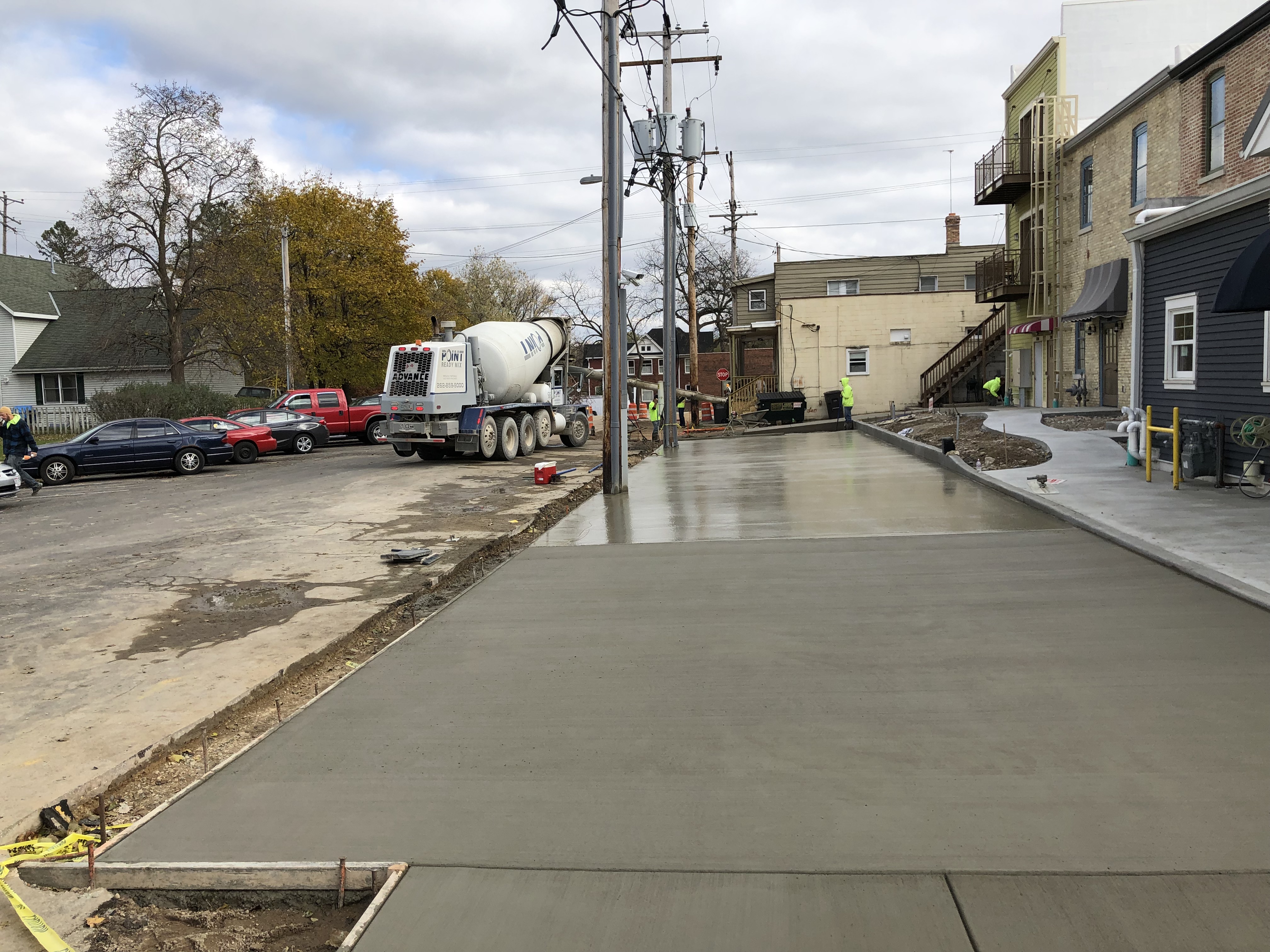
I suppose it’s about time I try to insert some kind of image, so here’s a shot I took today of some concrete that got poured behind the building my office is in.
I think it’s a little weird that the default new-block buttons are: image, header, and gallery. (I think think it’s even weirder these change over time to be my most-used blocks. Consistency is gone.)
It’s weird when I hover over the “P” for paragraph button, that it changes to 2 arrows creating a circle. No other buttons change their contents on hover; what makes that one special? And it changing makes me afraid to interact with it, because I’m afraid of what it does now.
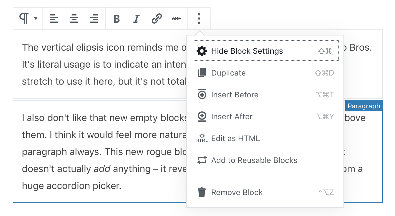
The vertical elipsis icon reminds me of Pokey the cactus from Super Mario Bros. It’s literal usage is to indicate an intentional omission of a word, so… it’s a stretch to use it here, but it’s not totally semantically inaccurate, I guess?
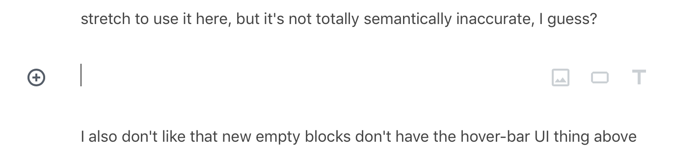
I also don’t like that new empty blocks don’t have the hover-bar UI thing above them. I think it would feel more natural if the new default block were just a paragraph always. This new rogue block has a “+” next to it, but clicking it doesn’t actually add anything – it reveals a menu to pick the block type from a huge accordion picker.
The more that I move the mouse to pick blocks and click on things, I’m noticing a lot of hidden UI reveal itself and then disappear in ways that don’t feel natural to me. I’m not digging this part of the experience at all. There are grey and blue hover/focus outlines on blocks, toolbars pop-up, the buttons in them have tooltips that pop-up, and there’s a grabber UI for relocating blocks that comes and goes – it’s just… a lot going on.
I’m going to try the drop cap feature on this block. It’s turned on (blue) now, but I don’t actually see a drop cap. If I save and preview the post, it’s there, but it’s not in the editor. Oddly, it’s targeting both the “I” and the apostrophe from “I’m” which doesn’t seem correct. Why wouldn’t it just target the first letter by itself?
Oh. So the drop cap is only visible when I’m not typing in the box. When I hit enter and created a new block, the drop cap became visible in the editor. That feels super weird, but it’s hard to know if that’s a bug or a feature. That’s kinda how I feel with most of this so far – it all feels like everything is very intentional, while also feeling like nothing I want it to do.
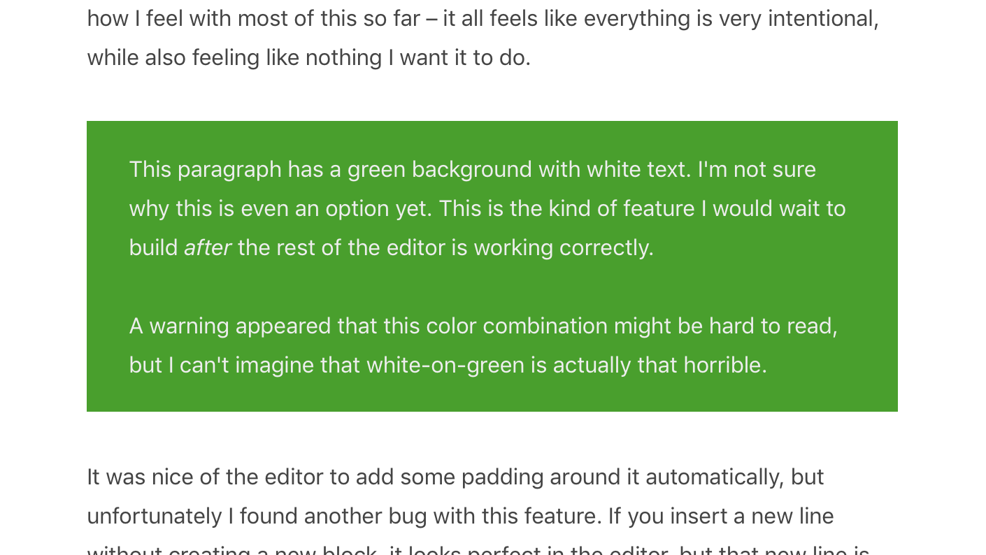
This paragraph has a green background with white text. I’m not sure why this is even an option yet. This is the kind of feature I would wait to build after the rest of the editor is working correctly.
A warning appeared that this color combination might be hard to read, but I can’t imagine that white-on-green is actually that horrible.
It’a a running joke amongst some close friends that I’m going color blind, specifically around oranges and reds. Naturally, I don’t see that as a problem. 🙄
It was nice of the editor to add some padding around it automatically, but unfortunately I found another bug with this feature. If you insert a new line without creating a new block, it looks perfect in the editor, but that new line is interpreted as a new paragraph when previewing it theme-side.
Editor 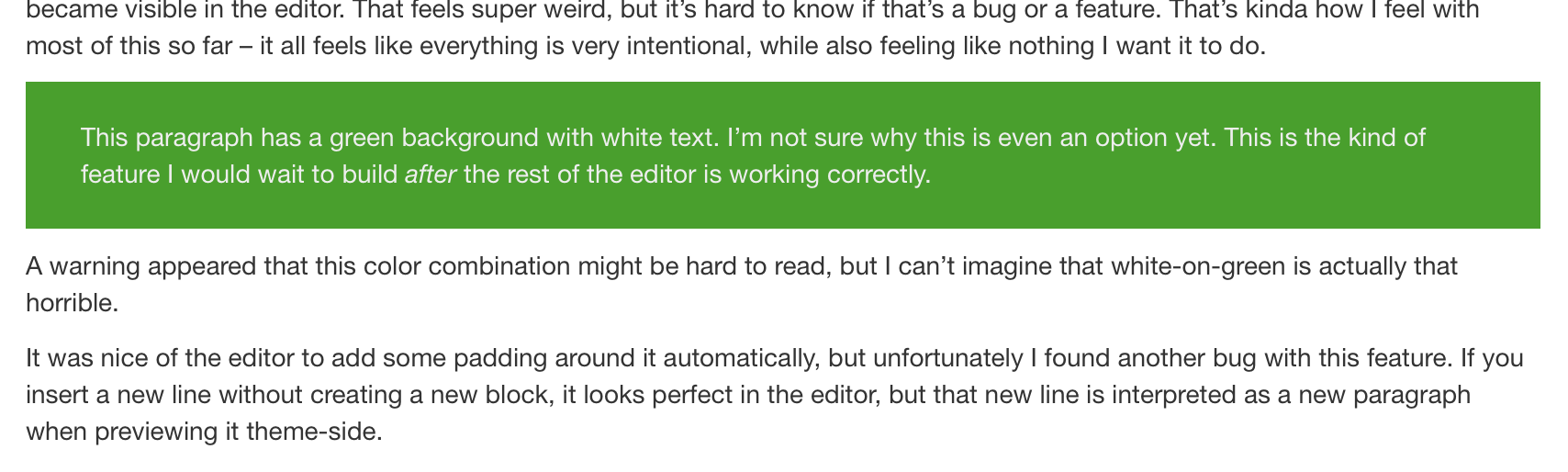
Theme Side
These side-by-side images went in pretty normally, but I think the gradient effect is not the greatest.
It’s odd that the “Settings” sidebar thing, under “Block”, doesn’t actually let you change the block type there. It shows what kind of block it is, but clicking it does nothing. Why isn’t that a block-picker? It has the same icon in it as the hover-bar thing, but it’s not interactive.
I also noticed in writing this that I’m not sure what the many, many UI dinguses are actually named. Inspector? Toolbar? Is a meta-box still what we call these inspector sections? Is there a glossary of terms somewhere?
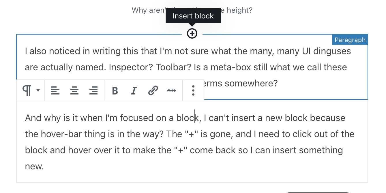
And why is it when I’m focused on a block, I can’t insert a new block because the hover-bar thing is in the way? The “+” is gone, and I need to click out of the block and hover over it to make the “+” come back so I can insert something new.
I just floated that button over there, which worked OK, but now I lost it because I inserted a block ahead of it. No idea how that happened. Let me try that again. OK I think it’s back. Color picker is nice. Why no hover color or effect?
The button block had a button with an “enter” looking arrow in it that, when hovered over, popped up a tooltip that said “Apply.” I clicked it, and it didn’t do anything. I assume it applied, but what did it apply? Why is it an “enter” arrow looking thing? I’m feeling a bit overwhelmed with iconography at this point.
- Let’s try a list
- How’s it work?
- What formatting options does it have
- In the “Settings” inspector bar thing, it looks like it has no settings
- The hover-bar is back. What’s it got there?
- Oh, all the typical list settings are there, but they disappear when I type
- Hovering over the list icon brings back the double arrows again. No like.
- I can indentPressing tab does not indentI can’t get multiple indented list items to work
- When I click enter, it doesn’t retain the indentation
- Nested lists are totally broken and not working
This is a quote block. This theme of mine supports them. Hopefully it works!
–JJJ
Clicking enter has me locked into the citation block
I can’t get out
Looks like I need to use the arrow-down key to get out.
Phew. That was close.
This is a heading. The “Settings” inspector thing has options here. I can pick H1-6, plus text alignment. I’m gonna center it, because why the heck not.
I'm gonna write some 1337 code in this box.

Hitting enter in here also does not break me out of the block.


No matter what I do.

I guess it's arrow-down time again.
Yep. That did it. But now that I’m in this paragraph block, arrow-down doesn’t do anything. So weird.
Hitting enter got me here.
^— That’s a spacer. Why is that even a block option when basic things like lists don’t work correctly?
Let’s try columns
Hitting enter kept me in this one
Hitting tab kinda focused on this one, but I still couldn’t type in it.
Finding the parent block to adjust the number of columns is really hard.
There’s only a 1px target to click to target the parent block to make this 3rd column
Hitting enter makes a new block in this column
I needed to hit the down arrow to get out of the column block.

Mr. Paul!
Here’s me testing the “Media & Text” block. This one seems to work like I expect it to, except there is no parent-block hover-bar picker thing, and clicking the image doesn’t do anything. I expect that to pull the media library back up. How do I change that image?
Oh. I need to click the parent block for a hover-bar to appear. So, now it’s a click-bar? Huh.
I couldn’t enter out of the above block, so arrow-down again!
Hitting enter brings me to a new line in this same block.
Now, hitting enter a third time brought me here. That felt like a bug, but I’m honestly not sure how I’d duplicate it.
THIS IS A PULL QUOTE
Benjamin Franklin
Had to arrow-down out of that one, too. I guess it’s just paragraphs that need entering out of, and maybe other random ones?
That button should take you to a post about bbPress 2.6 caching. Having buttons like that is a nice touch, but theme-side, it’s not even a button – it’s an anchor. 🤦♂️
On that 🎵 I think I’ve done all the testing I can do for 1 hour. ✌️
Oh wait… Category search doesn’t work. UGH.