While working on some 2x retina images for WordPress.com, and the bbPress and WordPress open-source projects, I found an image rendering issue that I haven’t seen documented anywhere yet. Here’s the WordPress core retina ticket, for reference.
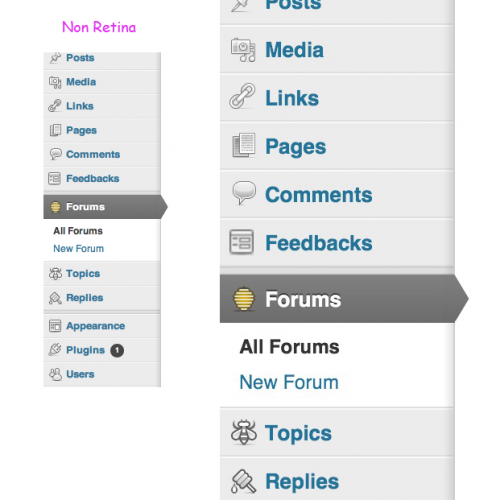
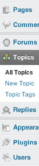
The first image highlights the difference between the WordPress core 2x icons, and the bbPress 2x icons. Notice how the icons next to Forums, Topics, and Replies have a slightly thicker black outline, specifically in 2x mode. The icons next to Posts, Pages, et all, are WordPress’s icon32 equivalents, with the same border thickness as the original 32px icons used in the 1x headers.
Using the original 32px icons was a great idea for a first-pass win at having 2x icons in WordPress core, and there are 64px equivalents now too! The difference between the WordPress and bbPress icons is subtle but important when you look at the second image in the gallery.
If the browser loads 2x images, but the display (for whatever reason) renders in 1x mode, you naturally end up with downsampled 2x images. To purposely duplicate this behavior:
- Have a Retina MacBook Pro.
- Connect Cinema Display.
- Open Safari.
- Move Safari 50% between the rMBP display, and the Cinema Display.
- Watch any 2x images downsample to 1x size.
While edge case, the circumstances where a browsers’ calculated pixel ratio does not match the display are a new bug from a new convention. Arguably, operating systems and graphics cards should handle this more smoothly, and I suspect they will eventually. Until then, if the risk is providing a worse experience than plain-old 1x images, it’s our responsibility to include 2x images that will downsample to a usable state in 1x mode.
Weird, wild stuff!